I recently had a colleague ask me about how to represent language areas for one language group alongside other languages spoken in the area. The observation was that many languages with a small number of speakers share geographical locations with more widely-spoken languages. In some cases, you might work with a few speakers of a language in different cities/villages, and you want to identify the locations where the language is spoken, which happens to be shared with speakers of other varieties.
In this blog post I’ll be illustrating one possible way to represent languages on a map with overlapping boundaries. It is important to acknowledge that there is not a direct relationship between language and geography in the same way that there is a direct relationship between physical landmarks or geological features and geography. It is a truism, however, that speakers of languages live in environments or locations, and that they traditionally occupied or claimed an area in which they resided and sustained themselves.
What we are representing, then, when we draw language lines on a map, is the area where you might find speakers of a particular language. While we could also represent the number of speakers of a language in a given area (density; via color grading or some other means) we would probably want to justify this in some way (perhaps increased density would correspond to language contact concerns, for example).
Getting the data and determining what to map
There are several sources for polygons to map languages of the world, some of which can be found via Glottography. For world languages, the most comprehensive is from Asher & Mosely (2007), which is available as map shapefiles and polygons on Github.
For this tutorial will be working with data primarily from the Khasian lects that I created maps for some time ago. Recent developments in mapping technology has meant that the most useful format to have map coordinates in is now a GeoJSON. I converted the Khasian data to this format, and you can drop GeoJSON files into tools like geojson.io in order to visualize them.

Besides loading polygons for languages, I’ll also be illustrating how to use a set of point coordinates to create a new polygon. This might be necessary if you’ve worked with speakers in certain areas, or done a language survey, and want to represent these locations as part of a larger area. In the case of the Khasian varieties shown in the map linked above, I was able to identify settlement locations for some Pnar and War groups - these were non-contiguous areas that required some manual drawing in order to join them to the larger group.
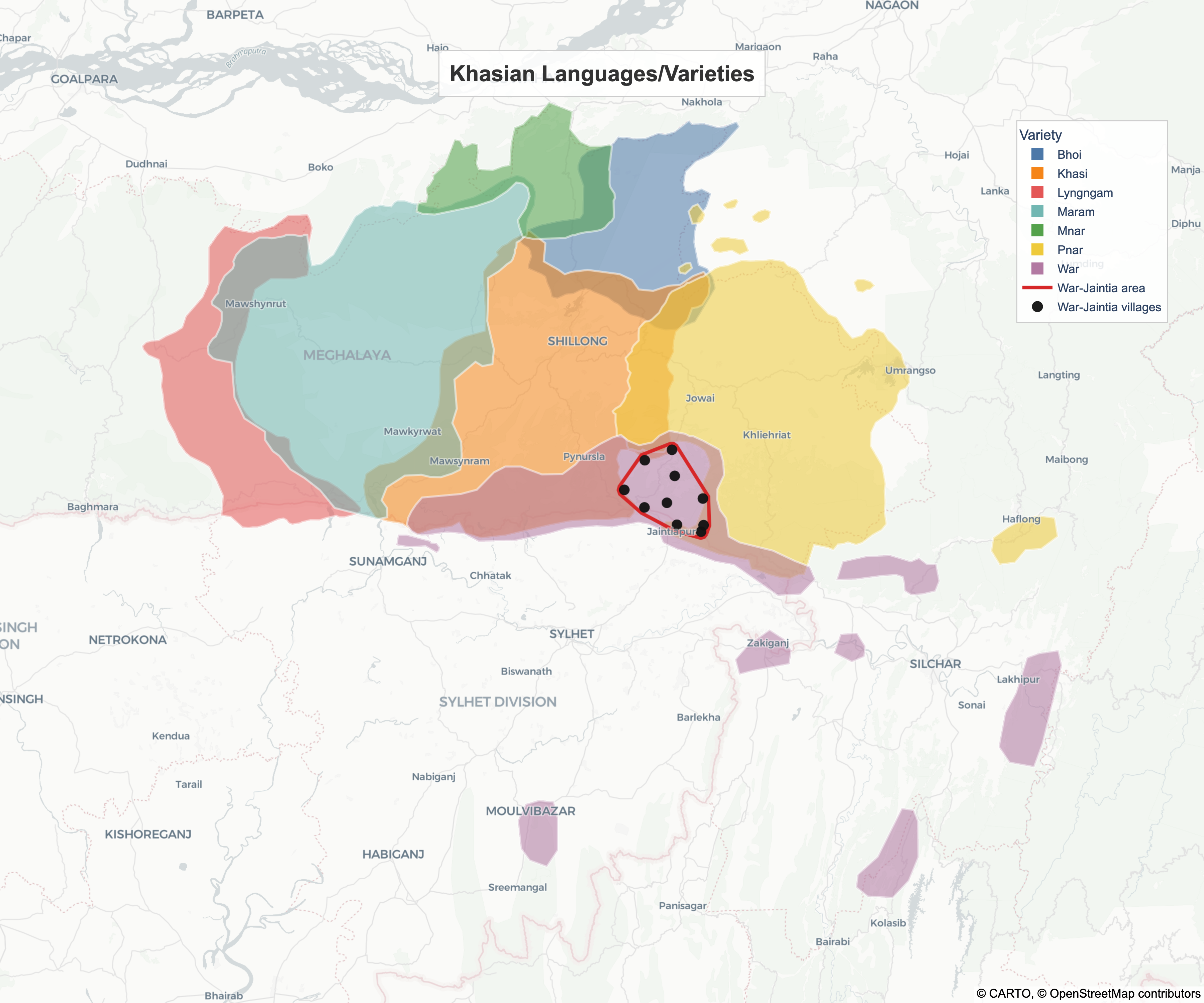
However, another source of data I have is from a lexical survey among the War-Jaintia (the report for which is in my queue for writing up). We can use village coordinates from this dataset to create a polygon, illustrating one way of overlaying new geographical information onto existing map features.
As with previous tutorials, we will be using Python and I’ll be assuming that you’ve set up a Python (>=3.10) environment and have some familiarity with writing and running Python scripts (i.e. via a terminal). For a basic setup tutorial, you can follow these instructions.
Downloading and preparing the data
To follow this tutorial, you will need to
download the GeoJSON file
Khasian_lects.geojson from the
Github link above and store it in your local
directory. We are also incorporating a dataset
of individual village coordinates. In this
example, we will use a hardcoded list of 10
villages that represent part of the War-Jaintia
survey area.
First, ensure you have the necessary libraries installed:
pip install geopandas plotly pandas shapely kaleido
The following code loads the linguistic polygons from the GeoJSON and prepares our village data as a Pandas DataFrame.
import geopandas as gpd # library for working with geographical data
import plotly.express as px # plotting library
import pandas as pd # dataframe library
from shapely.geometry import MultiPoint # additional geometry functions

# read the main polygon file and store as a data frame
gdf = gpd.read_file("Khasian_lects.geojson")
gdf = gdf.set_index('title')

# dict of a sample of 10 War-Jaintia villages
hardcoded_villages = [
    {'Name': 'Kamsing', 'Latitude': 25.1318313131874, 'Longitude': 92.2045116093526},
    {'Name': 'Pdengkarong', 'Latitude': 25.1467965963027, 'Longitude': 92.2110020013812},
    {'Name': 'Jarain', 'Latitude': 25.3209328085304, 'Longitude': 92.1300758653413},
    {'Name': 'Nongbareh', 'Latitude': 25.2284124351375, 'Longitude': 92.0084931213465},
    {'Name': 'Jong U Chen', 'Latitude': 25.1986304683602, 'Longitude': 92.1172060208704},
    {'Name': 'Mawlong', 'Latitude': 25.2967911656806, 'Longitude': 92.0608449716946},
    {'Name': 'Shmia Shyiang', 'Latitude': 25.2083486111111, 'Longitude': 92.2090723577189},
    {'Name': 'Jaralood', 'Latitude': 25.2606762011997, 'Longitude': 92.1372524792752},
    {'Name': 'Amlympiang', 'Latitude': 25.1878389911967, 'Longitude': 92.0599916609569},
    {'Name': 'Hawai Bhoi', 'Latitude': 25.1478193483565, 'Longitude': 92.142881123891},
]

df_filtered_villages = pd.DataFrame(hardcoded_villages) # store it as a dataframe
Mapping the polygons and coordinates
To create a cohesive map, we perform three main steps:
- Generate a Convex Hull: We
take all the village points and calculate their
convex_hullto find the smallest polygon that encloses them. - Apply a Buffer: We add a
small margin (
0.015degrees) to this hull to create a “coverage envelope” that accounts for the area surrounding the surveyed points. - Layered Plotting: We use
plotlyto layer the linguistic polygons (base layer), the red coverage boundary (middle layer), and the individual village markers (top layer).
There are a few additional steps that
need to happen as well, as we’re setting up the
canvas for drawing. Besides choosing the base
map layer that ensures our coordinates/polygons
are located appropriately, we need to zoom in to
the area covered by our mapping coordinates. To
do all these things we use the following
code.
# generate the polygon surrounding the points
points_geom = MultiPoint([(row['Longitude'], row['Latitude']) for _, row in df_filtered_villages.iterrows()])
convex_hull = points_geom.convex_hull

# add a margin buffer around the point assets
margin_buffer = 0.015
war_polygon_with_margin = convex_hull.buffer(margin_buffer)

# extract precise exterior coordinate shell arrays
hx, hy = war_polygon_with_margin.exterior.xy

# get coordinates for the view window around the main polygon plot
minx, miny, maxx, maxy = gdf.geometry.total_bounds
lon_padding = (maxx - minx) * 0.25
lat_padding = (maxy - miny) * 0.25
center_lon = (minx + maxx) / 2
center_lat = (miny + maxy) / 2

# choose a set of colors for the different polygons
color_sequence = px.colors.qualitative.T10[:len(gdf)]

# set up the map with the following properties
fig = px.choropleth_map(
    gdf, # our data
    geojson=gdf.geometry, # the coordinates
    locations=gdf.index, # the location names
    color=gdf.index, # which items to color
    color_discrete_sequence=color_sequence, # the colors
    map_style="carto-positron", # the basemap
    opacity=0.55, # transparencey level for polygons
    center={"lat": center_lat, "lon": center_lon}, # how to center the view window
    zoom=8.1, # zoom level for the window
    labels={'color': 'Language Classification'}
)
This code has provided us with the basic map for the languages spoken on the Meghalaya plateau, but now we want to add the polygon and points that we derived from the survey data. Do do this we can overlay two different scattermaps, as with the following code.
# overlay the new polygon with a boundary
fig.add_scattermap(
    lon=list(hx),
    lat=list(hy),
    mode='lines',
    line=dict(
        width=3.5, # extra thickness to frame the backdrop polygon
        color='#D62728' # high-contrast bold crimson red profile
    ),
    name="War-Jaintia area", # name of the polygon
    hovertemplate="<b>Boundary:</b> Coverage area<extra></extra>" # what to display on hover (in a webpage)
)

# overlay the War-Jaintia villages as points
fig.add_scattermap(
    lon=df_filtered_villages['Longitude'], lat=df_filtered_villages['Latitude'],
    mode='markers', marker=dict(size=11, color='#111111', opacity=0.95),
    text=df_filtered_villages['Name'], name="War-Jaintia villages",
    hovertemplate="<b>Village:</b> %{text}<extra></extra>"
)
Finally, we can add the margins, a legend, and some extra styling, before exporting the image in high quality and displaying it in an interactive webpage.
# apply title layout card and legend settings
fig.update_traces(marker_line_color="white", marker_line_width=2.0, selector=dict(type='choroplethmap'))
fig.update_layout(
    # set margin and background colors
    margin={"r": 0, "t": 0, "l": 0, "b": 0}, paper_bgcolor='rgba(0,0,0,0)', plot_bgcolor='rgba(0,0,0,0)',
    # set map view position
    map=dict(center={"lat": center_lat, "lon": center_lon}, bounds={"west": minx-lon_padding, "east": maxx+lon_padding, "south": miny-lat_padding, "north": maxy+lat_padding}),
    # set title parameters
    annotations=[dict(text="<b>Khasian Languages/Varieties</b>", x=0.5, y=0.95, xref="paper", yref="paper", showarrow=False, font=dict(size=22, family="Arial", color="#333333"), align="center", bgcolor="rgba(255, 255, 255, 0.85)", bordercolor="#CCCCCC", borderwidth=1, borderpad=10)],
    # set legend parameters (anchor to the right)
    legend_title_text="Variety",
    legend=dict(yanchor="top", y=0.88, xanchor="right", x=0.97, bgcolor="rgba(255, 255, 255, 0.85)", bordercolor="#CCCCCC", borderwidth=1, font=dict(size=12, family="Arial"))
)

# write the image to a local file
fig.write_image("khasian_war_map.png", width=1200, height=1000, scale=3)
# show the image in an interactive webpage
fig.show()
That’s pretty much it. We now have a couple of options to play with - an interactive webpage that we can export images from, and some settings that we can adjust to directly produce a high-quality image. There are a lot of ways to configure the display to visualize particular aspects of linguistic geography, provided you have the data, so it is important to be clear about what you want to visualize from the outset.
Conclusion and thoughts
This tutorial has illustrated how coordinates can be visualized simply using Python. Since there is different information that we want to convey regarding where languages are spoken, it may be necessary to use both polygons and points to display the various relationships. Language areas often overlap, since speakers are not necessarily bound by arbitrary political boundaries, which means our visualizations should reflect that reality.
The “coverage envelope” that we can create around existing points allows us to present survey data as a continuous area, making it much easier for readers to see how specific dialect clusters sit within the broader linguistic landscape. This approach is particularly valuable for linguists working in regions with high levels of multilingualism and complex geographic distributions. If your focus is specifically on visualizing sociolinguistic variation (isoglosses, for example), this can also be done, though I’ll have to make that the subject of a separate post.
References
Asher, R. E. & Christopher J. Moseley (eds.) 2007. Atlas of the World’s Languages. 2nd edn. Routledge.